07 26 16
Rhythm In Design Composition
.I chatter over stony ways, In little sharps and trebles, I bubble into eddying bays, I babble on the pebbles
Still nothing. So, I told my teacher I heard a brook. I didn’t hear a brook, of course, but that’s what I said, because, well, I knew all there was to know and I knew that is what she wanted to hear. I passed the final and in the summer I took a trip to the Smokey Mountains near Pigeon Forge. I walked a downhill slope on the seasonally green mountainside. When I reached the bottom, the slope had descended into, you guessed it, a brook. My nemesis. I watched the water rush past, skipping over rocks and sediment, freshening the air with chill. Tennyson’s poem filled my thoughts. By many a field and fallow, And many a fairy foreland set With willow-weed and mallow. To my surprise, I could actually “hear” the brook flowing in Tennyson’s words: Ts as the water chattered over stoney ways, Bs as the brook babbled on the pebbles, and that slow S streaming leisurely through the entire piece. That was it. I heard it. As clear as the water itself. That little revelation changed everything about how I approached design.
Design, web or print, is no different than Tennyson’s poem. It has sound.
In truth, what is rhythm but pattern, a form that grows in familiarity? We can channel that familiarity in the way we compose our work. We can create our own sound. There are many tools at your disposal to help develop a sound in your design. Managing space, pacing, color, movement, and disruption will shape your euphony into the style that appeals to your audience.In its architecture, rhythm allows it to transcend a two-dimensional canvas and deeply connect with us through compositional euphony.
Space
Sound for the sake of sound is just noise. Sound needs silence–requires it as silence is what activates tone. Without silence, sound alone would drive us mad. The same principle applies to negative space in design. Graphic elements are as notes on a sheet. Imagery, Typography, and Iconography represent those sound notes. The space around them is the silence. How those elements(notes) and space(silence) are composed structures the visual and didactic consumption of information. Structural composition is the most important element in creating rhythm in design. Space, is what sets the stage for the show, akin to a needle touching a record. Together, space and element set the framework for your sound.
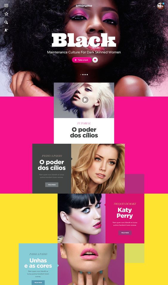
 Visually, think in terms of percentage based rows and columns. Rows and columns create a grid of squares over a canvas or viewing frame. It goes without saying that screen sizes in web design and print will vary, but the principle remains true; the more squares that contain graphic elements, or are colored in, the more sound exists in the frame. The placement and size of those colored squares, stacked atop one another, alternating side to side, filling in the bottom, or only the top initiates the rhythmic pattern. If you imagine those colored squares as musical notes, you can actually begin to hear the sound as your eyes navigate the space.
Pacing
Especially in long form pieces or scrolling websites, the pace with which you deliver your message is the groove. Some people like fast-paced rhythm while others something mellow. If you have a sense of your audience, you can pace your work in such a way that it appeals to them.
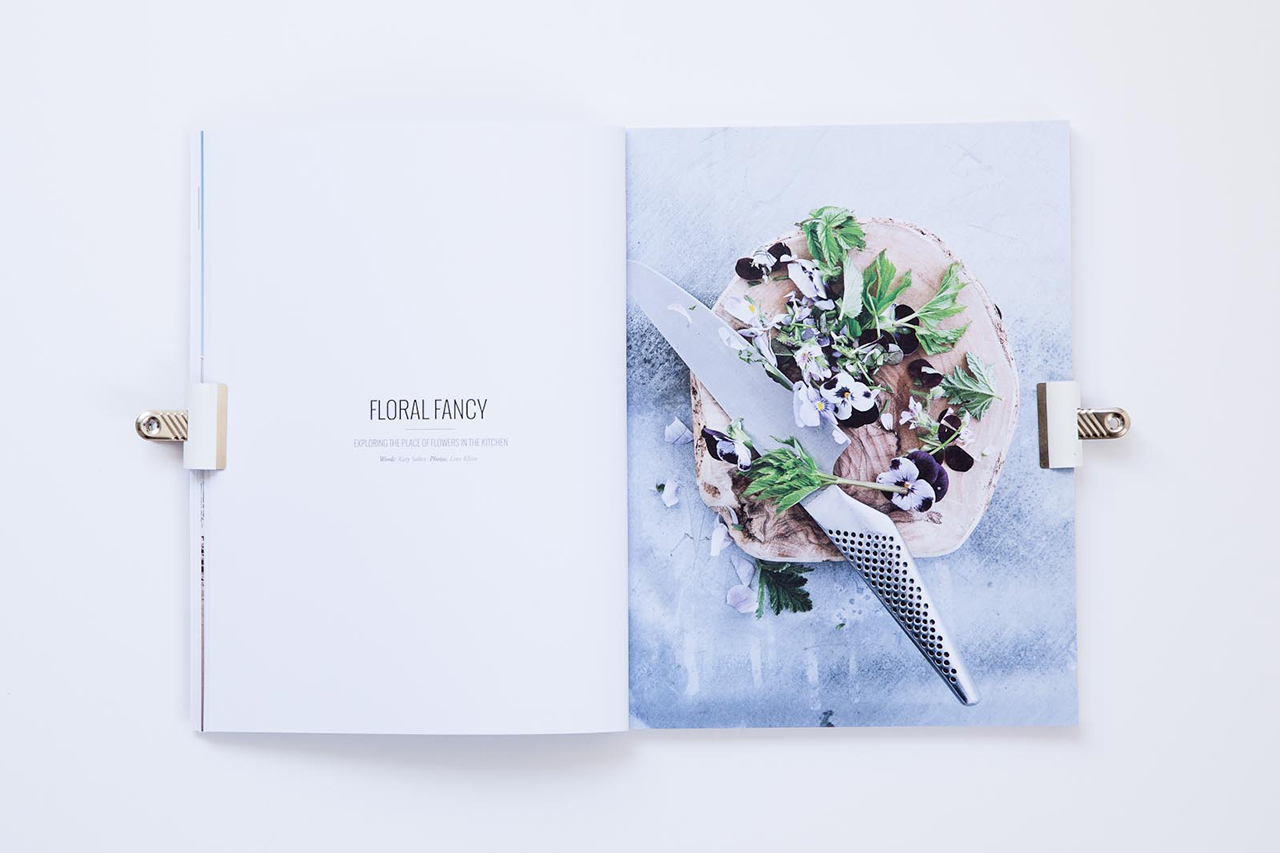
If you aim to do something distinct or novel or even jarring, pacing is where you make that decision, it is also where the story atop the rhythm begins. Pacing is where a piece can feel undulating, repetitive, alternative, gradual, and even disruptive. Cereal Magazine, one of my personal favorites, aligns pace with the content of their written pieces. They deliver smaller bits of copy with loads of space and large imagery to create a sense of a building crescendo as you read through. A similar experience can exist across any medium from web design to interior design. Pacing is the cadence by which a work is both created and received.If space is the structure, pacing is the meter. With websites, the typical approach is big header, content area, footer. This is akin to a pop song or a poem in iambic pentameter. It goes does down easy and a user can groove to it without much thinking.
Color
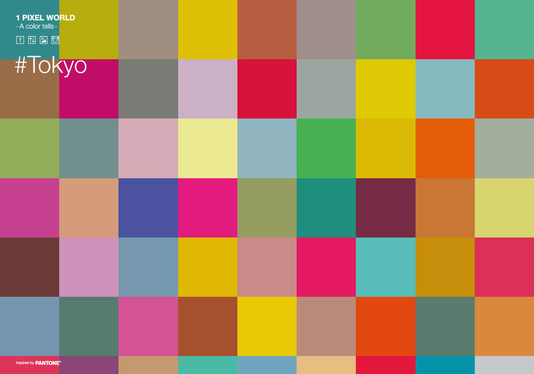
Color in design has enough theories and principles to fill a library of books. There are innumerable choices to make when deciding on a color, so begin with emotion. Rhythmically, color arouses mood and will be the emotional context of your rhythmic pattern. Are you aiming to inspire cheerfulness, anger, elegance, comfort, optimism? The selection of a color, or no colors at all, can offer an almost lyrical quality to your work through the emotion it stirs.
For example, if your pacing is fast, lots of information shown rapidly, and the tone of the piece is red it might provoke a sense of aggression. If the same is true, but the tone is yellow, the piece will likely feel zealous. Color is the first rhythmic layer of voice in any work; the first to definitively express an intent. Understanding the psychology of color first will help in deciding on a color scheme that best articulates that intent. If space is the structure and pacing is the meter, then think of color as the melody. Color schemes, monochrome, complementary, analogous, and triadic act as a means of communication from the composer to the audience.
Movement
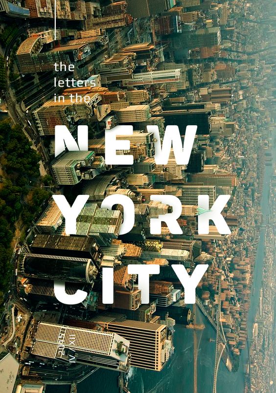
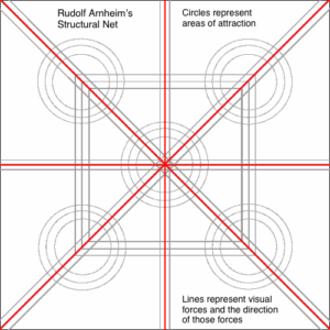 In Rudolf Arnheim’s book, Art and Visual Perception: A Psychology of the Creative Eye, he proposes that there is a structural skeleton behind every canvas that uses a network of forces. The eyes are naturally drawn to certain parts of the canvas. There are other diagrams that support similar notions such as the Gutenberg diagram, the F-pattern layout, and the Z-pattern layout, all suggesting that viewers would already assume a natural flow to any work. Knowing this you can take advantage of the movement and increase their ability to consume the information you want. Movement can happen in the use of video, in imagery, but can often find it’s most powerful impact in typography and shape. Movement is most closely tied to the overall rhythm as it will force a user to deviate from pattern to read. Compositional flow and shape of typography, with knowledge of natural movement patterns, can help you tell your story by presenting information in the right order and at the right scale. Eyes will navigate and consume information in a hierarchical pattern you control. In a literal and figurative way, it is storytelling. In the manner story progresses, undulating peaks of conflict and resolution, appropriate use of typography in a composition can push viewers to the places you want while allowing the most important pieces to shine.
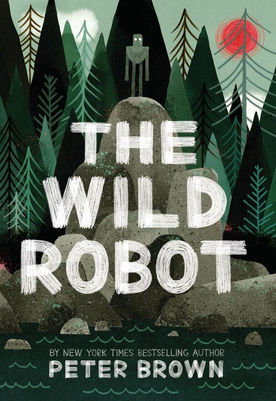
Start with font. Fonts come in a myriad of types; tall fonts, square fonts, serif, san serif, handwritten, cursive, and many others. In the same way Tennyson selected words that equated to the sound of water, select a font that helps drive your purpose. Readability, boldness, lightness, cohesiveness, size, and shape should all be considered in terms of how it works with the flow of your work. Using variants in font weights, kerning, and positioning of text can speed up or slow down movement as well a direct it where you wish it to go.
Disruption
Because, why the fuck not?
There are times when you’ve decided on spacing, pace, selected a monochromatic color scheme, and a lovely handwritten font that makes for a smooth rhythm throughout your work and, for all intents and purposes, you think it is right to just disrupt the whole thing. It is a fine line to walk, no doubt, but can make for a stunning change in the rhythm.
But be careful. Break pattern in a meaningful way. Contrast, accent, and sudden imbalance can turn a common a work remarkable, but can also undermine it’s intent.
Summary
Everything has sound. There is a music that can be exposed in everything you create. Considering rhythm in your work only taps into something that is omnipresent and imbues it with a familiar force. Rhythm is pattern and pattern is memorable. Try it for yourself. Consider the rhythm in your design as you compose it. Is it groovy, fast-paced, smooth, lighthearted? As a viewer experiences your creation what do they hear? What is the beat thumping in their thoughts or the melody stuck in their head simply by the composition of your work? If you can hear it, so can they.





Leave a Reply